Thursday, 30 October 2014

Futurism

So what were the characteristics of graphic design by now?
An  Layout,
the Elimination of decoration, and the move towards more bold and geometric forms.

In Germany, Peter Behrens created 4 new typefaces, Behrens Antique, Behrens Schrift, Behrens Medieval, and Behrens Cursiv. His assistants at AEG were Walter Groupius, Mies Van der Rohe, and Le Corbusier. Other designers at the time were Lucian Bernhart (Germany) and the Beggarstaff Brothers (Great Britian).

Also, surfacing at the time were the Plakastil, the object posters. These were posters with no verbal elaboration, only the image portraying the object’s use or message.

Opel – Hans Rudy Erdt.
Panther - Ludwig Hohlwein.

Then came Futurism in 1909, which emphasized the technology and dynamic aspects of modern lives. It rejected harmony and order, preferring instead to portray speed and movement into the design. Looking at the early futurism posters, we can see confusion and agitation; in the beginning they even tried to translate sounds into images and design.

The city rises – 1910

The leader was Filippo Tumaso Mariutti. Helping him to start this movement were Umberto Boccini, Carlo Carna, Giacomo Balla and Gino Severini. They challenged the idea that type had to follow any convention, so they experimented vastly with new forms. This was a way of making a statement, to emphasize the force of the words, and, being a new style it caught the reader’s attention more and more.

Umberto Boccini        – the street enters the house 1911
-       unique forms of continuity and space 1913

Giacomo Balla            - Swift paths of movement 1913

Gino Severini            - Still life with Lacerba 1913

One of the characteristics of Futurism was simultaneity and repeated notifs. The posters were dynamic and the lines of force were very strong in the picture. They also included elements of collage into their designs. They also included typographical collages in their posters.

Marinetti – Futurist Manifesto cover 1915

Marinetti’s revolution stated that futurist designs should have different typefaces of different shapes and sizes on the same page, with three or four colours of ink, with use of italics and nomal type. Keep in mind that at the time the only colours to be depicted in posters were monotonic colours, or single colours. Also the type was consistent throughout the whole design. So this was seen as quite radical. But he was inspired a lot by Cubism, and by the fascination to depict sound and movement into design.

Marinetti – Zang Tumb Tumb (1914)

Marinetti’s cover of 8 Anime in una Bomba


Here Marinetti was after the destruction of harmony and peacefulness on the page and in favour of  ‘flux and reflux, leaps and bursts that run through the page’.  We can see the words are overlaid and set in different directions, giving us the notion of speed and movement.

links:
https://designopendata.files.wordpress.com/2014/06/24969324-design-literacy-understanding-graphic-design.pdf
http://www.historyofinformation.com/expanded.php?id=4461
http://www.theartstory.org/movement-futurism.htm

Wednesday, 29 October 2014

Art Nouveau

It was opposed to previous styles, therefore the name Art Nouveau. This Art Nouveau was influenced by Rococo, Japanese Art, Celtic Art, Egyptian Art and Gothic Revival.

It had different names, in Vienna it was Sezzesionstil –(Gustav Klimt, Hoffman), In Germany it was Jugendstil (-Otto Eckman, August Endele), In Italy it was Stile Liberte, In Spain it was Modernista (- Anton Gaudi) and in America it was considered to be an extension of the Arts and Crafts movement (-Louis Sullivan).

It began in a shop and interior design gallery in Paris called Le Maison de l’arte Nouveau owned by Samuel Bing in 1895. Art Nouevau symbolized the “new art form”. It was happening at the time of the French Belle Epoque, before the first world war. This was a time where there was a prosperous middle class, and a lot of pleasure seeking bourgoise.

Artists of the time were:

Hector Guimard - Street Furniture
Eugine Grasset – Encre L. Marquet (1899)
Jules Cheret – Hippodrome (1895)
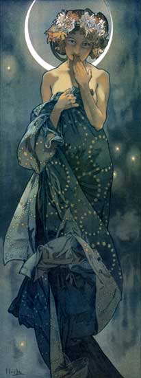
Alphonse Mucha –    The Moon (1902)
                                   
Gisimonda (1895)
                                   
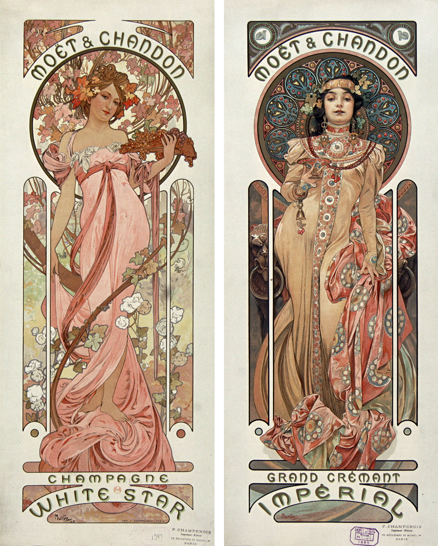
Moet é Chandon (1899)
                                   
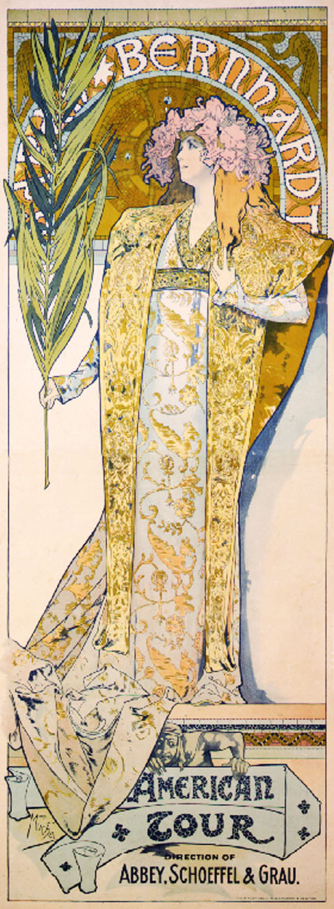
Sarah Bernhandt in Hamlet (1899)
                                    
Louie Fuller – Dance performer whose graceful serpentine movements inspired her sculptures.
Audrey Beardsley – follower of Aesthatic Movement with Lars Tiffany and Francois Eugene Rousseau ( they influenced the Art Nouveau movement through its use of abstracted Japanese forms).
Edward Burnes Jones – the knight’s farewell
Beardsley – J’ai Baise ta Bouche
è large dark areas contrasted with large white ones
è fine detailed patterns
è estatic & erotic
è sinous
è a style more grotesque
-       Peacock skirt
-       Isolde (1898)
Will Bradley – like Beardsley but emerged when Beardsley died, situated in America

In Belgium: Henry van der Velde – Stained Glass panels Brussels
In Glasgow: Charles Renne Mackintosh      – early organic style
-       compared the progressive modernity with the spirit of romanticism

Art Nouveau: Stylization to the extreme
                        Curves and shapes to understand underlying geometric form

In Austria: led by Gustav Klimt. Kolomon Moser & others – evolved from Symbolist movement & French Art Nouveau

Kolomon Moser        
Ver Sacrum poster
Book stamp for Fritz

In Germany emerged the Deutscher Werkbund, consisting of Peter Behrens, Mies Van der Rohe and Josef Hoffman.  This organization’s aim was to standardize and rationalize form for machine production.

Peter Behrens was linked with the Jugendstil, and he was very inspired by William Morris. He was a pioneer Industrial Designer, and was praised as a gesamthuntwerk (total work of art). He says, “all aspects of design must be given equal attention and be coordinated in the same style”.

In design he was important for his early symbolic prints, which were clean & sober, had the element of symmetry, used contrasting colours, were artistic yet rational, and used elongated Roman calligraphic letter types.
He also influenced Walter Gropius when opening the Bauhaus.

links:
http://www.slideshare.net/umertariq93/modern-architectures-umer-tariq
http://www.bpib.com/illustrat/mucha.htm
http://www.theartstory.org/movement-art-nouveau.htm


Saturday, 11 October 2014

Graphic Design

What is Graphic Design?

Graphic design is a creative process that combines art and technology to communicate ideas. The designer works with a variety of communication tools in order to convey a message from a client to a particular audience. The main tools are image and typography.
                                                            -AIGA

So we then ask ourselves, what is the difference between graphic design and art?
            The answer is a not so simple and very debatable one, but the best way to explain it is that there is little difference between the two. However while an artist is not bound by conveying a message and can go down the abstract road, the graphic designer must convey a message that is made to be interpreted clearly.

In graphic design there are two walkways, propaganda and advertising. The difference is that propaganda is selling an idea, and advertising is selling a product.

Graphic design can be ephemeral or permanent. Ephemeral design includes posters, calendars etc., while permanent design includes logos, signs etc.

Signs and Symbols
            These also fall under the category of graphic design. Different types are the street signs, rebus (a pictoral image representing a sound)  and a ideograms (a symbol representing a whole idea). 


Graphic design dates back to 3300BC, in Mesopotamia. Priests used hieroglyphs to write down prayers, magical texts, and texts related to life after death and worshiping the gods.


links:


Sunday, 5 October 2014

Woodblock Printing

One of the most appreciated innovations of the Tang and Song dynasties were the inventions of the woodblock printing and the moveable type.  The first known notion of woodblock printing was in China around the year AD 600, and it was probably inspired by the older practice of seals to make impressions on clay and melted wax. This process of block printing on paper was perfected within the lifespan of the Tang Dynasty.
                                           
With the printing process also came a sophisticated paper industry with a more wide array of paper materials with different qualities for specific projects.  The original wood blocks were made from pear and date trees. The process for creating a wood block was quite straightforward. The text (or glyph) was first written on a piece of paper. This was then glued to a block of wood, and by the use of a knife the characters on the paper were carefully etched on the wood. The surface of the wood block was then inked and covered with a sheet of paper. After application of gentle pressure to the paper the character would be printed onto the paper.

The first use of woodblock printing was for the printing of calendars, calligraphy and charms, as well as for books on agriculture and medicine. The oldest existing printing in wood blocks that survived is the Mugujeonggwang great Dharani sutra that dates back to between AD 704 and 751. In the year 762, the first printed books were sold in the markets of Chang’an, the capital of Tang. Printed receipts were available in the markets for business transactions and tax payments.

Although woodblock printing was an important factor in the spread of information around China, it was very time consuming. These limitations led to the invention of moveable-type printing. This was invented between 1041 and 1048 AD (the Song Dynasty) by an experienced wood block printer by the name of Bi Sheng. He decided to make a clay type for each character, then he had them fired to get hard. A layer of resin, wax, and paper ash mixture was placed on the bottom of an open iron box to hold the type with characters facing up. The bottom of the box was heated to melt the wax mixture, and simultaneously all the typeface was pressed down with a wood board to ensure that the types were level. Finally the tops of the clay types were inked, and the mechanism would then be ready for printing just like a wood block. Afterward the clay types could be disassembled and reused. 


links: 
http://en.wikipedia.org/wiki/Woodblock_printing
http://www.metmuseum.org/toah/hd/ukiy/hd_ukiy.htm