Thursday, 1 January 2015

Bauhaus

It’s foundations lie in the early 20th century art movements, like the Arts and Crafts movement, whose aim was to unite creativity and manufacturing, and also to re-establish the fine line between fine arts and applied arts. It started out out as a sort of romantic crafts guild, but then started stressing on uniting art and industrial design.  It was this trait that proved to be the school’s most important and significant achievement. The school was also known for having the top class artists of the time teaching there, some of which were Wassily Kandinsky, Paul Klee, Moholy-Nagy, Walter Gropius and Mies Van der Rohe.


During the late 19th century creativity and manufacturing were drifting apart, and architect Walter Gropius founded the school to start uniting them once more.  Bauhaus emphasized on intellectual and theoretical pursuits, and helped young artists link these pursuits to artistic crafts and techniques. This emphasis revolutionized the way art education was carried about, and it also led to the fine arts becoming more into the visual arts, and also the idea that art is not like literature, but it is something which is an expression of character.


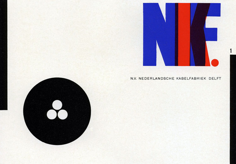
Characteristics of the Bauhaus influences in Graphic Design include order and symmetry in their layouts and design. They also used a lot of geometrical, functional and modern forms, in contract to the organic forms in the earlier movements. They started using rectangular grid structures, and used geometric shaped to divide and separate graphic elements on the page. Horizontals and Vertical lines were very dominant on the page.


There was also an inclusion of different typefaces and type sizes to create an amphasis by the contrast created. There were also no serif typefaces in this movement, to keep the layout as clean as possible. The type and pictures were also sized to the same column width, again sticking to the rectangular grid structure. They used a method of colour similar to the constructivists, black, white and a single strong hue.


Moholy Nagy introduced also a vast knowledge of constructivism, and a passion for photography and photomontage, to create the so-called typophotos. Nagy describes them as such;
                 
                             "What is typophoto? Typography is communication composed in type. Photography is the visual presentation of what can be optically apprehended. Typophoto is the visually most exact rendering of communication."


links: 
http://monoskop.org/L%C3%A1szl%C3%B3_Moholy-Nagy
http://www.iconofgraphics.com/laszlo-moholy-nagy/
http://bauhaus-bauhauss.blogspot.com/2009/09/bauhaus-characteristics-in-graphic.html
http://www.archdaily.com/tag/walter-gropius/
http://www.theartstory.org/movement-bauhaus.htm


Sunday, 16 November 2014

De Stijl

 De Stijl

It started in 1917 with Theo Van Doesburg, and it influenced international avante garde in the 20’s. It was very committed to the unity of the arts, on a quest for harmony and order through a universal language of form. De Stijl rejected all representation and self expression.  It was restricted to the use of straight lines, right angles, primary colours, and the so called non colours; black, white and grey.

Unlike it’s predecessor, Dada, it sought to regain order in design. The overall look was disciplined, due to the use of sans serifs, straight lines and rectangular blocks. The layout was asymmetrical. The De Stijl movement paved the way to the international typographic style. Later on, Van Doesburg introduced his ideas to the Bauhaus.
This movement came to an end in 1931 when Van Doesburg passed away.

Piet Mandrian – Composition (1920)
This here is an example of neo plasticism

Composition with blue yellow and red (1921)

The De Stijl manifesto cover was a clear example of DeStijl characteristics. The layout combined heavy lines, sans serif types, and an assymetric composition.

Van Doesburg, as we mentioned earlier, was the forerunner to this movement. He was an architect, a writer, a designer, and a painter. He was sent to the war, and when he was near the front he began comtemplating a new manifesto, for a movement called De Stijl: Maandblad voor nieuwe kunst, wetenschap en kultuur. In 1916 he met other artists with similar thoughts as his, and they started De Stijl. So De Stijl was a reaction to Dada and to the war, where everything was chaotic and not nice and very distracting. De Stijl sought to regain order, and as we mentioned before, it paved the way to the typographic styles we currently have in our magazines, posters and all around us.

Theo Van Doesburg – Contra Construction (1923)

Theo Van Doesburg – Counter Composition IV (1924)

Theo Van Doesburg – Rectilinear Sans Serif Type

Another De Stijl Graphic Designer is Vilmos Huszar. Huszar experimented with and created highly geometric logotypes, with letters wrapped around each other, text breaking down into abstract forms, all reflecting on the Gestalt psychology.

Gestalt – The emphasis on the relationship between parts that creates the perception of the whole.


Piet Zwart was another De Stijl artist. He applied constructivism in his works. He is known for rejecting the traditional typographic conventions and creating his own way, with bold sans serif, repetitive word patterns, photomontage, primary colours, and strong diagonals.


links:
http://kemperartmuseum.wustl.edu/collection/explore/artwork/484
http://www.tate.org.uk/art/artists/theo-van-doesburg-1017
http://www.theartstory.org/movement-de-stijl.htm

Wednesday, 12 November 2014

Timeline In Graphic Design

1455 – Gutenberg Press
1480 – Intaglio Printing
1750s – Gothic Revival
1798 – Stone Lithography
1814 – Grotesque Typeface
1846 – Rotary Press
1880 – Photo Engraving
1885 – The Half Tone process
1886 - Linotype
1837 – 1901 – Victorian Era
1905 – Offset Lithography
Mid 19th Century – Arts and Crafts Movement
1890-1910 – Art Nouveau
1917 – De Stijl
1919 – Bauhaus
1925-50s – Art Deco
Jan Tchihold
1930s & 40s – Swiss Modern (1st Generation)
1950s & 60s – 2nd Generation of Designers
1940s & 50s New York School        -  Paul Rand
-       Alvin Lusting
-       Saul Bass
-       Bradley Thompson
-       Alexei Brodovich
-       Herb Blueblin
1957 – Helvetica
1960s – Pop design – Milton Glaser
            - Phototype setting   
1960s & 70s – Psychedelia – Seymour Schwast
                                                - Victor Moscoso
                                                - Wess Wilson
                                                - Rich Griffin
                                                - Peter Max
1970s – Digital type
            - Margaret Tatcher   – rebelled through punk rock and anarchy
                                                -Jamie Reed
                                                - Neville Brody
                                                - Peter Seville
                                                - Barney Bubbles
                                                - Malcolm Garret
1984 – invention of the Macintosh 
1980s – Post Modernism     - Wolfganag Weinhart
                                                - April Greiman
                                                - Barbra Kruger
                                                - William Longhauser
                                                - Deborah Sassman
                                                - Takmo Bu
                                                - Kazumasa Nagai
1990s – Grunge        – David Carson
                                  - Art Chantry
1994 – the invention of the World Wide Web
1998 – Google
2000s – Stefan Sagmeister
           - Paula Scher
2001 – Wikipedia
2005 – Youtube


List of Post Modern Designers         - John Koi
                                                            - Tibor Kalman
                                                            - Allen Wang
                                                            - James Huff
                                                            - Michael Mabry
                                                            - Jay Vigan
                                                            - Allen Chan
                                                            - Mark Fox
                                                            - Glenn Parsons

                                                            - Bridget de Socio

Sunday, 2 November 2014

Dada (& Surrealism)

DADA

Dada was considered to be the highest art, described by Dadaists that it “ will be the art which has been visibly shattered by the explosions of last week, which is forever trying to collect itself”.

The founder was Hugo Ball. Also helping him found this movement was Tristan Tzara and Jean Hans Arp. They met and they sought spontaneity through childhood and care.  They used a number of magazines to promote their art. This is a direct attachment to graphic design. Jean Hans Arp applied the law of chance to his artworks, and later on his fellow Dadaists adopted his law. 


Club Dada 1918-20
Der Dada   1918-20

Max Ernst      -The Elephant Celebes

-Murdering Airplane (1920)

Kurt Schwitters, another Dadaist, introduced machine made words not arrange in any traditional rules instead of hand drawn images. He also used narrow range typeface instead of the normal typeface used at the time. He later on invented the Merz, Schwitters published a periodical called Merz between 1923–32, in which each issue was devoted to a central theme. Merz 5 1923, for instance, was a portfolio of prints by Hans Arp, Merz 8/9, 1924, was edited and typeset by El Lissitzky, Merz 14/15, 1925, was a typographical children's story entitled The Scarecrow by Schwitters, Kätte Steinitz and Theo van Doesburg. The last edition, Merz 24, 1932, was a complete transcription of the final draft of the Ursonate, with typography by Jan Tschichold. It was at this time that graphic design emerged as part of the modern industrial society.

Photomontage was used also in the dada movement, to construct rather than to paint. The Russian Constructivists introduced this into their designs also, roughly at the same time as it started getting popular with Dada.

Gustav Klimt - Lenin walking over the world

Some characteristics of Dada graphic design as illustrated in this poster are dynamic diagonals and sans serif typefaces. They used black, white and red, and their design influenced the Bauhaus and the Constructivists.

Hannah Hoch Collage (1919) – used fragments of images taken from pop culture and incorporated them into the Dada artworks.
Hannah Hoch – Pretty Maiden (1920)

Above we see Jon Heartfield’s parody poster in favour of the industry. Written at the bottom is  ‘Iron makes a country strong, butter and lard make people fat’. He created many pro Communist posters and in the 60’s he created anti-Vietnam posters.

John Heartfield - War and corpses
George Grosz – Dusk
George Grosz – Eclipse of the Sun

Dada ended in 1922, and was considered the forerunner of Surrealism.

Surrealism

This art movement challenged the rational and was attracted towards the imagination potential in dreams. Main artists in this movement were Juan Miro, Jean Hans Arp, Man Ray and Salvador Dalí.
This movement did not include much graphic design so will not be included.


links:
http://www.peachpit.com/articles/article.aspx?p=2140091
http://www.smithsonianmag.com/ist/?next=/arts-culture/dada-115169154/

http://www.askart.com/AskART/interest/Modernism_2.aspx?id=75