De Stijl
It started in 1917 with Theo Van Doesburg, and it influenced
international avante garde in the 20’s. It was very committed to the unity of
the arts, on a quest for harmony and order through a universal language of
form. De Stijl rejected all representation and self expression. It was restricted to the use of straight
lines, right angles, primary colours, and the so called non colours; black,
white and grey.
Unlike it’s predecessor, Dada, it sought to regain order in
design. The overall look was disciplined, due to the use of sans serifs,
straight lines and rectangular blocks. The layout was asymmetrical. The De
Stijl movement paved the way to the international typographic style. Later on,
Van Doesburg introduced his ideas to the Bauhaus.
This movement came to an end in 1931 when Van Doesburg
passed away.
Piet Mandrian – Composition (1920)
This here is an example of neo plasticism
Composition with blue yellow and red (1921)
The De Stijl manifesto cover was a clear example of DeStijl
characteristics. The layout combined heavy lines, sans serif types, and an
assymetric composition.
Van Doesburg, as we mentioned earlier, was the forerunner to
this movement. He was an architect, a writer, a designer, and a painter. He was
sent to the war, and when he was near the front he began comtemplating a new
manifesto, for a movement called De Stijl: Maandblad voor nieuwe kunst,
wetenschap en kultuur. In 1916 he met other artists with similar thoughts as his, and they started De Stijl. So De Stijl was a reaction to Dada and to the war, where everything was chaotic and not nice and very distracting. De Stijl sought to regain order, and as we mentioned before, it paved the way to the typographic styles we currently have in our magazines, posters and all around us.
Theo Van Doesburg – Contra Construction (1923)
Theo Van Doesburg – Counter Composition IV (1924)
Theo Van Doesburg – Rectilinear Sans Serif Type
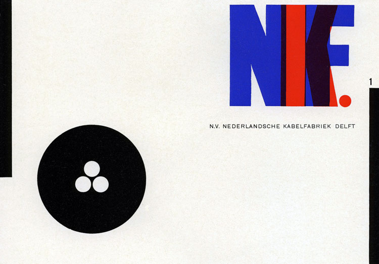
Another De Stijl Graphic Designer is Vilmos Huszar. Huszar
experimented with and created highly geometric logotypes, with letters wrapped
around each other, text breaking down into abstract forms, all reflecting on
the Gestalt psychology.
Gestalt – The emphasis on the relationship between parts
that creates the perception of the whole.
Piet Zwart was another De Stijl artist. He applied
constructivism in his works. He is known for rejecting the traditional
typographic conventions and creating his own way, with bold sans serif,
repetitive word patterns, photomontage, primary colours, and strong diagonals.
links:
http://kemperartmuseum.wustl.edu/collection/explore/artwork/484
http://www.tate.org.uk/art/artists/theo-van-doesburg-1017
http://www.theartstory.org/movement-de-stijl.htm
http://www.tate.org.uk/art/artists/theo-van-doesburg-1017
http://www.theartstory.org/movement-de-stijl.htm


No comments:
Post a Comment