Monday, 5 January 2015

Pop Art

Pop Art

Milton Glaser, one of the foremost of the Pop Art graphic designers made use of posters such as civil rights, womens’ movement. Environmentalism, and from these he produced funny and eclectic designs.

I heart NY, 1970

Seymour Schwast, another graphic designer of the Pop Art movement, was a co – founder of the push pin studio. This was a studio for graphic designer, founded by Milton Glaser, Reynold Ruffins, Edward Sorel and Seymour Schwast.
The images he produced were influenced mostly by primitive imagery.

End Bad Breath


His designs were also very playful and he offered an alternative to the swiss design which was very convenient at the time because the masses were getting bored of the same old boring rigid typefaces and layouts. In addition to moving away from the same old boring style, Schwast introduced illustration into his work also. He loved and appreciated the past and included many Victorian figurines and letter forms into his design. He also combined a lot of text and image to resemble German expressionists woodcut with primitive art colouring. Although I have mentioned that he copied the past, he did not copy it. He rather looked to the past and had a certain style of ‘adapt and adopt’.

Alphabet designs
Dante’s Divine comedy

Another great Pop Art Graphic Designer was Shigeo Fukuda.  He created posters with the barest minimum of components, with simplicity like that of logos, often satirical and always well and perfectly designed. Needless to say this is my favourite artist from this era. His work experiments with negative space and perspective, and inducing visual and geometric interplay between elements on the poster, often muddling the viewer with the induced depth and irregular visual planes. His trademark design evolved from Swiss graphic design and he also kept very true to Japanese prints and style. He used a very limited colour palette and obvious lines to create illusions. He passed away in 2009. He is described as “Japan’s consummate visual communicator.”


Although with all this happening in the United States and the majority of Pop Artists evolving there, we assume that it originated there, it actually originated in Great Britian, with the artwork; Just what it is that makes today’s homes so different so appealing.


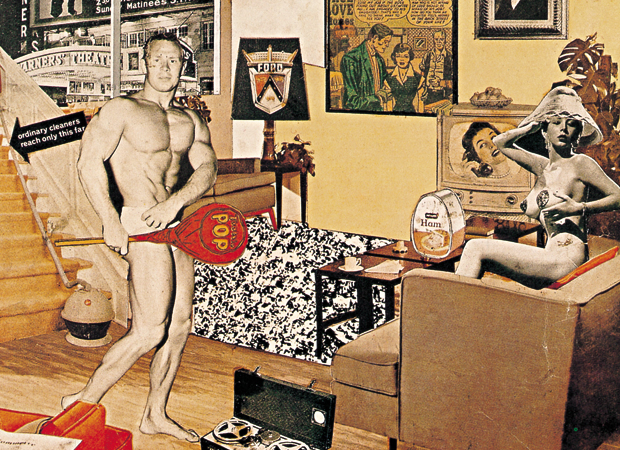
With Pop Art there was a feeling of excess, of consumption and indulgence, and also of advertising sex. Pop artists took the idea that Art can be made from (as described by Marcel Duchamp) ready mades and continued to build upon it. Leading Pop artists who used this method were Andy Warhol and Richard Hamilton. Pop Art was also centered around the conceptual, the idea having more actual meaning than the artwork itself.


links:
http://degreeconcertina.tumblr.com/
http://www.aiga.org/medalist-seymourchwast/
http://www.creativebloq.com/art/pop-art-8133921

Friday, 2 January 2015

New York School

The New York School was an informal group of American abstract painters and other artists active in the 1950s and 1960s. These artists valued spontaneity and improvisation, and they accorded the highest importance to process. They were influenced by artists such as Jackson Pollock and William de Kooning.

Breaking away from accepted conventions in both technique and subject matter, the artists made monumentally scaled works that stood as reflections of their individual psyches—and in doing so, attempted to tap into universal inner sources. Their work resists stylistic categorisation, but it can be clustered around two basic inclinations: an emphasis on dynamic, energetic gesture, in contrast to a reflective, cerebral focus on more open fields of colour. In either case, the imagery was primarily abstract. American design was pragmatic, intuitive and less formal in its approach to organising space. Emphasis was placed on the expression of ideas and an open, direct presentation of information.


Paul Rand was an editorial designer in 20's, and worked with AIGA for a number of years. He reduced design to symbol without being boring. He used collage and montage to bring elements together, and included a variety of textures, pattern and objects in his designs. Rand uses logotype, photography, drawing, and type to create a very dynamic composition. Was one of the first to use semiotics to create memorable works.


Alvin Lustig started his career in design at 21 years of age, when he used to work at a printing press at an LA Drugstore. He studied at Yale University.In his works he implied abstract geometric designs through type and ornament. He combined form and content as one. His style included a block background and concrete abstraction. He is mostly known for his book cover designs.


Bradbury Thompson was known for using new printing techniques. Throughout the years he obtained a vast knowledge of printing and typesetting, and he included these a lot in his works. He used a technique called the four colour printing technique.


Soul Bass was the designer who took NY school to California. He was influenced a lot by Paul Rand, and he was also known mainly for his title sequences. In fact, he was the creator of the title sequences we have today. In his designs he incorporated one central image as the whole design. He used simplified forms to represent his ideas, and executed them in a casual way to keep form from being rigid. He too, used phototypesetting. He also used cut out text and film to create collage.


Herb Lulabin created both verbal and visual concepts. He was mostly known for his editorial design. He believed that space and surface was important for more flexibility.
He made ligatures and extreme scale prints, and worked with overlapping and phototype settings. In his line of work he was also required to work with typograms. He designed various fonts, including Avant Garde and Avant Garde Gothic.


links:
http://quizlet.com/11548032/the-new-yorl-school-movement-flash-cards/
http://anm102pm.files.wordpress.com/2010/11/chapter-19-pdf-2.pdf
https://www.boundless.com/art-history/textbooks/boundless-art-history-textbook/europe-and-america-1900-1950-36/abstract-expressionism-230/the-new-york-school-823-1926/


Thursday, 1 January 2015

Bauhaus

It’s foundations lie in the early 20th century art movements, like the Arts and Crafts movement, whose aim was to unite creativity and manufacturing, and also to re-establish the fine line between fine arts and applied arts. It started out out as a sort of romantic crafts guild, but then started stressing on uniting art and industrial design.  It was this trait that proved to be the school’s most important and significant achievement. The school was also known for having the top class artists of the time teaching there, some of which were Wassily Kandinsky, Paul Klee, Moholy-Nagy, Walter Gropius and Mies Van der Rohe.


During the late 19th century creativity and manufacturing were drifting apart, and architect Walter Gropius founded the school to start uniting them once more.  Bauhaus emphasized on intellectual and theoretical pursuits, and helped young artists link these pursuits to artistic crafts and techniques. This emphasis revolutionized the way art education was carried about, and it also led to the fine arts becoming more into the visual arts, and also the idea that art is not like literature, but it is something which is an expression of character.


Characteristics of the Bauhaus influences in Graphic Design include order and symmetry in their layouts and design. They also used a lot of geometrical, functional and modern forms, in contract to the organic forms in the earlier movements. They started using rectangular grid structures, and used geometric shaped to divide and separate graphic elements on the page. Horizontals and Vertical lines were very dominant on the page.


There was also an inclusion of different typefaces and type sizes to create an amphasis by the contrast created. There were also no serif typefaces in this movement, to keep the layout as clean as possible. The type and pictures were also sized to the same column width, again sticking to the rectangular grid structure. They used a method of colour similar to the constructivists, black, white and a single strong hue.


Moholy Nagy introduced also a vast knowledge of constructivism, and a passion for photography and photomontage, to create the so-called typophotos. Nagy describes them as such;
                 
                             "What is typophoto? Typography is communication composed in type. Photography is the visual presentation of what can be optically apprehended. Typophoto is the visually most exact rendering of communication."


links: 
http://monoskop.org/L%C3%A1szl%C3%B3_Moholy-Nagy
http://www.iconofgraphics.com/laszlo-moholy-nagy/
http://bauhaus-bauhauss.blogspot.com/2009/09/bauhaus-characteristics-in-graphic.html
http://www.archdaily.com/tag/walter-gropius/
http://www.theartstory.org/movement-bauhaus.htm