Friday, 30 January 2015

Grunge - David Carson

In the 1980s and 1990s, type became messy. Words were being made to be more expressive and show the real raw feeling behind them. Concert posters especially looked like someone had scratched the words out of the paper. It was a time when Nirvana and such bands came to the forefront with grunge rock, a chaotic and raw music, which the typography reflected very well. This was a time where Cd copies were being made, and zines were being passed around.


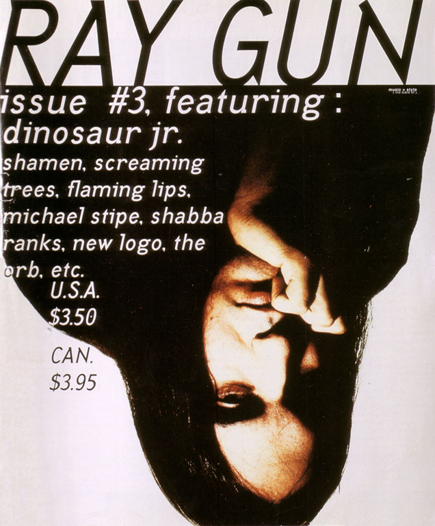
For zines to be made, someone has to design the covers and pages. David Carson, who is the father of Grunge, designed the magazine Ray Gun. He did not have any education in the arts or in design, he graduated with a degree in Sociology, but his style was well made for the exact movement. His design sought to be expressive and very very raw. When I look at his designs, I always want to go in his direction, because they’re so raw and enticing and they draw you in and you feel a wave of emotion going through you.
His two main rules were;
the rules don’t have to be known for you to break them
to never mistake legibility for communication.


This second rule is a strong point of his. When seeing the words he puts in his posters, you get a gut feeling of what the word means, and you usually see enough of the word to know and feel what he is saying. He is known for his magazine covers of  Ray Gun, which kick started Grunge design. He once changed the font of an article to Dingbat because he disliked the article.


http://www.designishistory.com/1980/david-carson/
http://www.theawl.com/2012/08/grunge-typography

http://www.ted.com/talks/david_carson_on_design?language=en

Thursday, 29 January 2015

Swiss Modern

Modernism was not welcome in America in the beginning. The posters in America were more focused on traditional illustrations, and so the new rigid structure and sticking to a grid were not very welcome. By 1928/29 though, new typefaces were available in America such as Futura and Kabel.

William Addison Dwiggins was one of the first few American Graphic Designers to use Jan Tschihold’s typography and grid. He was also the first person to coin the term, “Graphic Designer”. He spent a lot of his time experimenting and playing around with page arrangement and layouts. In his design we see an odd combination of ornaments of the time combined with cubist designs. He designed 18 fonts, most popular of which are Electra and Metro.

In the 1930s there was a mass immigration of the European graphic designers to America, some of which who were George Salter, Erté, Dr. Mehmed Felumy Agka, Alexey Brodovitch, and Alexander Lieberman.

George Salter’s trademark was the book jacket. He had the very special talent to capture a book’s contents on its cover. As a medium he used calligraphy, photomontage, panoramic watercolours, airbrush scenes, & pen and ink drawings.

Fang and Claw


Absalom Absalom – 1936


A modernist who was most important in his style was Josef Muller Brockmann. His career as a graphic designer started “by accident”. He did not like to write a lot so he put illustrations in his compositions, and he was encouraged by his teacher to pursue studies in the artistic sectors. He learned a lot of techniques at the Zurich Gewerbeschule, including silkscreening and letterpress. In his design, he used the grid as his illustration, meaning he did not include any illustrations but merely placed the text in a pleasing way along the page.  Sometimes it was not even text. He also incorporates many a shifted axes in his designs.


One of the most influential designers for me was Massimo Vignelli. He applied the principles he was taught from his predecessors, but he kept a certain austerity in his designs, demanding humility from the receptor. “The designer's ultimate objective is not the pursuit of beauty, self-expression or wealth, but rather the forensic application of the guiding principles of design to every project, large or small.


http://guity-novin.blogspot.com/2011/07/chapter-42-swiss-grade-style-and-dutch.html
http://www.historygraphicdesign.com/the-age-of-information/the-international-typographic-style/805-ernst-keller
http://www.creativebloq.com/graphic-design/massimo-vignelli-61411897

Punk

Punk was an explosion. It was an explosion from the rigid, calm and controlled way of life found under the systems of Modernism. It was an explosion from the Grid, from Jan Tschihold and all his clean and well planned layouts. Punk began as a teenage rebellion. It was based mainly on anarchism, and on getting the job done in a non controlled way as possible. This movement was based mainly around music at the time. Teenagers took the sounds of the 50s, upped the tempo, and added lots of guitar and drums. The rise of punk rock from the small bands playing around neighborhoods to getting accepted by society as a new form of music was mainly due to two bands, The Ramones and The Sex Pistols, New York and London based respectively.

With these new bands there came a new identity for teenagers, a new sense of fashion, a new sense of ideals and expression. The punk fashion was a DIY process, much like their posters. The overall idea we get from Punk is it’s aggressive, raw and instantaneous feel.  Since Punk was an effort to get away from the mainstream media and mainstream everything of their lives they ditched all methods of poster making and printing and buying clothes to tearing, pasting and making their own.


Important Graphic Designers at the time were Jamie Reid, Neville Brody, Peter Saville and Malcolm Garret. Jamie Reid is known mostly for his working with the Sex Pistols. He made several of their album artworks, including, Never mind the Bollocks, Anarchy in the UK and his famous God Save the Queen.  His methods of design were mostly made of photocopies, made with shocking colours, collage, torn edges, cut up lettering, screen printing, and deconstructed images. A safety pin, cluttered pages, juxtaposition of images and anti-capitalist slogans were his signatures.


Neville Brody started creating Punk album artworks while he was studying Graphic Design, and he chucked design out of the window and embraced Punk. Peter Saville was part of Factory, and created some very beautiful sleeves which are iconic of Punk. Amongst these is his most famous Unknown Pleasures for Joy Division and New Order Power Corruption and Lies by New Order.